

Nearby: Connecting refugees with their new neighbors
Organization: Microsoft
Context: Design competition
Duration: 4 months
SNAPSHOT

BACKGROUND
As part of an invitation only design competition hosted by Microsoft, the company asked each team to design a product that would help enable empathy at scale. My team’s submission was a digital service to connect newly arrived refugees with their neighbors in order to receive support with everyday activities. The final delivery was a pitch presented to Microsoft, complete with a prototype and production-ready mock ups of all key screens within the app.
RESEARCH APPROACH


10 refugee support organizations
16 academic articles
15 established residents
9 refugees
Accessing a very isolated community
Our first challenge was gaining access to refugee communities. There was no clear method to find or recruit people. This was a population that was often isolated, skeptical of outsiders, and had little free time to participate in research studies. We used three different avenues to better understand the refugee experience. First, we connected with several support organizations that work directly with refugees and utilized their extensive interactions with refugees to conduct proxy interviews. Second, we utilized our personal network to connect with friends and family who were former refugees. And third, we established relationships with community leaders for populations with large refugee populations. Through these combined efforts we were able to have interviews with refugees from places as diverse as China, Somalia, and Serbia.
FINDINGS
Everyday tasks can be just as unfamiliar as major ones for newly arrive refugees
Support organization employees are spread thin and not able to help with day-to-day issues
Most residents don’t understand how difficult coming to a new country is
Empathy is best developed when interactions are face-to-face, voice-to-voice, or skin-to-skin

CONCEPT DEVELOPMENT
Selecting an audience and pain point
Our goal with our concept was not just to create empathy between refugees and established residents, but also to help refugees adjust and acculturate to their new environment. We went through multiple rounds of ideation and landed on four potential concepts; some focusing on children, others adults; some focusing on recreation, others on practical tasks. After testing concepts with potential users we found that all were equally liked. Our final decision came down to selecting one with the fewest logistical hurdles and that was easiest to scale up as we felt this would increase the chance of the apps’ success.
USER FLOW


Step 1
Select a category
of help
Step 2
Select remote or in person help


Step 3
Select immediate or delayed help
Step 4
Select availability
Step 5
Confirm request
Step 6
Select a helper


How many options is too many?
We wanted to make our system as flexible as possible but quickly realized that by providing so many options our flow was becoming too complex and convoluted.
To find the most popular methods I ran users through theoretical scenarios and asked which method of meeting (in person vs. remote/ immediate vs. scheduled) they preferred.


Step 1
Select a category
of help
Step 2
Confirm request
In emergencies, fewer is better
While most testers did not show a strong preference, interviews with refugee community leaders revealed that most new arrivals don’t know what they will require help with until the moment that it’s urgent and that due to lack of data plans and familiarity with smartphones, some individuals would be most comfortable interacting in person rather than over a phone. This helped us narrow our flow to offering only in-person, immediate support.
CONTENT STRATEGY


Moderate info
Minimal info
Robust info
How much personal info should we collect and share?
A big question for our team was how much information were people willing to share about themselves with strangers and how much information about a stranger did they want to see before meeting. I created three levels of information disclosure from basic to detailed and shared the designs with several people in our target user groups. While people loved seeing lots of info on others they did not want to provide much themselves.

Just enough to recognize someone and say hello
The most important items everyone wanted to see and were comfortable sharing were a first name and photograph so we decided to focus on this information.
ICONOGRAPHY

Be literal
(not symoblic)

Be universal (not cultrually specific)

Be true to form
(not simplified)
How do we make sure iconography is clear across cultures?
While we planned to offer the app in multiple languages, we learned that some refugees were not literate and relied solely on visual cues to navigate on a phone. This meant clear iconography was even more critical for success. Many of the refugees had never used smartphones before or frequented locations (like airports) that used universal icons so we could not rely on them understanding the most commonly used icons. We needed to rethink all visual depictions.

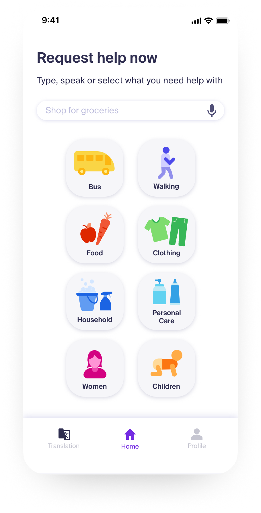
Start from scratch, and don’t rely on accepted norms
After having a conversation with a leading expert on decolonizing design, I sketched out entirely new icons to make sure they were not based on symbolism (like the male or female signs) or western cultural norms (such as using a fork and knife to depict food.)
FINAL PRODUCT OVERVIEW

Signing up

Requesting Help

Connecting

Communicating

Following Up