

Ser Familia: Creating a welcoming homepage
Organization: Ser Familia (non-profit)
Context: Contract
Duration: 4 weeks
SNAPSHOT
BACKGROUND
Ser Familia is a non-profit serving Atlanta’s Latino population, specifically focused on providing services to families related to mental health and domestic violence. I was asked to help them redesign their homepage to give it a more modern look, improve usability, and attract more donors.
AUDIENCE

Donors
Objective: Is this a good use of my money?

Volunteers
Objective: Can my skills be of use?

Service recipients
Objective: Is this something that would benefit me?
A challenge with Ser Familia (as with other nonprofits and charities) is that it had 3 distinct target user groups, each with different goals and calls to action. Yet we needed to make the homepage feel like it was catered to each of them.
OPPORTUNITIES

Focus/clarity
Provide a distinct focus for each section
Remove any redundancies
Visual hierarchy
Make calls to action (especially the donate button) more visually prominent
Declutter and create more whitespace

Updated aesthetic
Create a more modern, inviting feel
Simplify visuals and give them a more unified look
CONTENT STRUCTURE

Creating a clear focus
I reorganized the site’s content to make sure each section provided unique information. Each section aimed to answer one key question that a key user group might have in the logical order they might ask them. I started from giving an overview of all program offerings then providing evidence of their effectiveness through impact stats before asking the visitor to volunteer their time or donate their money.
LAYOUT

Improving scannability
One key goal at this stage was to give each section a little more breathing room to make the page feel less crowded and to help draw attention to one section at a time. Additionally, I wanted to make sure that a few key words or stats stood out in each section to orient those that were quickly scanning. I also made sure the CTAs were visually prominent on the page to help increase sign ups and donations.
VISUAL TONE
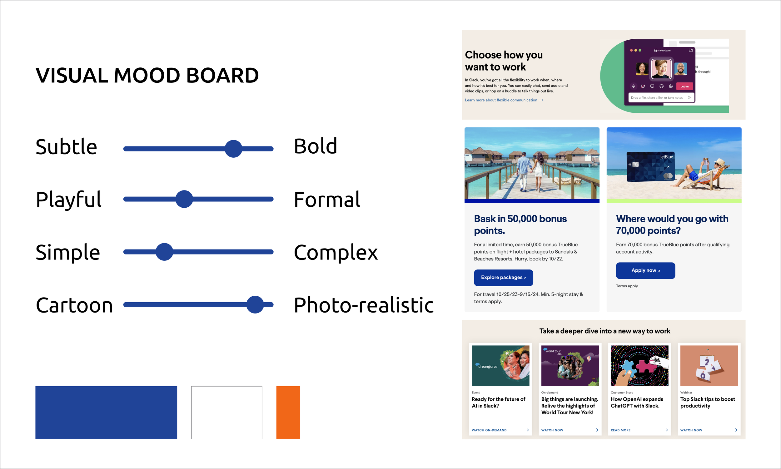
Conveying an inviting mood
The client wanted something that felt more modern than the original site and asked for something bold, bright, and attention getting.